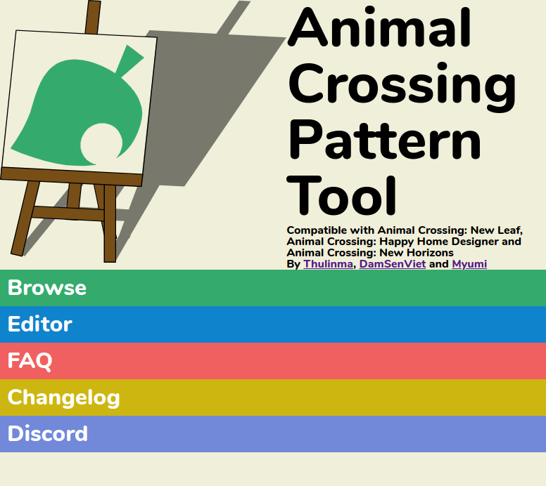
ACPatterns enables users to make pixel art designs on the web and convert photos into QR codes to be used in Animal Crossing: New Leaf and New Horizons. The goal of the redesign was to update the site to a modern look, imitating the pastel interface of New Horizons and staying true to the source material. I was responsible for creating a new logo, icons, backgrounds, and fine-tuning the colour palette. I created and am still running the Twitter account to promote the site and help users with questions.
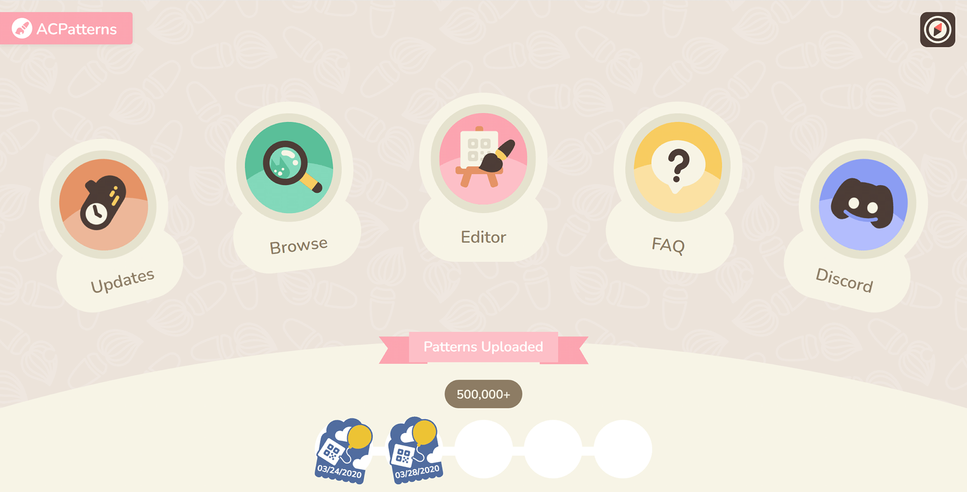
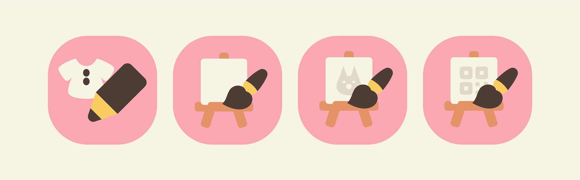
I didn't want to use the same 'pen over shirt' icon the game used and be original, so I went for a brush over an easel, a callback to the old logo of the site. Since ACPatterns biggest selling point is the photo-to-QR converter, I wanted the design communicate it clearly by putting a mini QR code icon on the easel and place the finished editor button in the dead centre of the website to be the first thing to notice when a user enters the site.
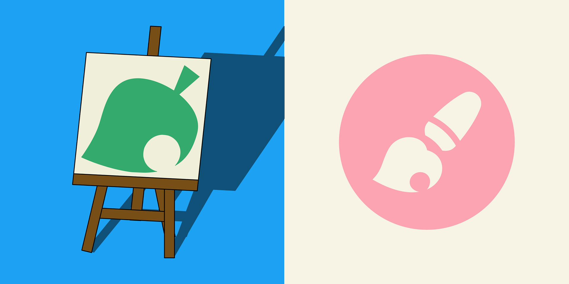
After making the editor icon I got the idea to combine Animal Crossing's signature leaf icon with a brush and it became the new logo on the right.
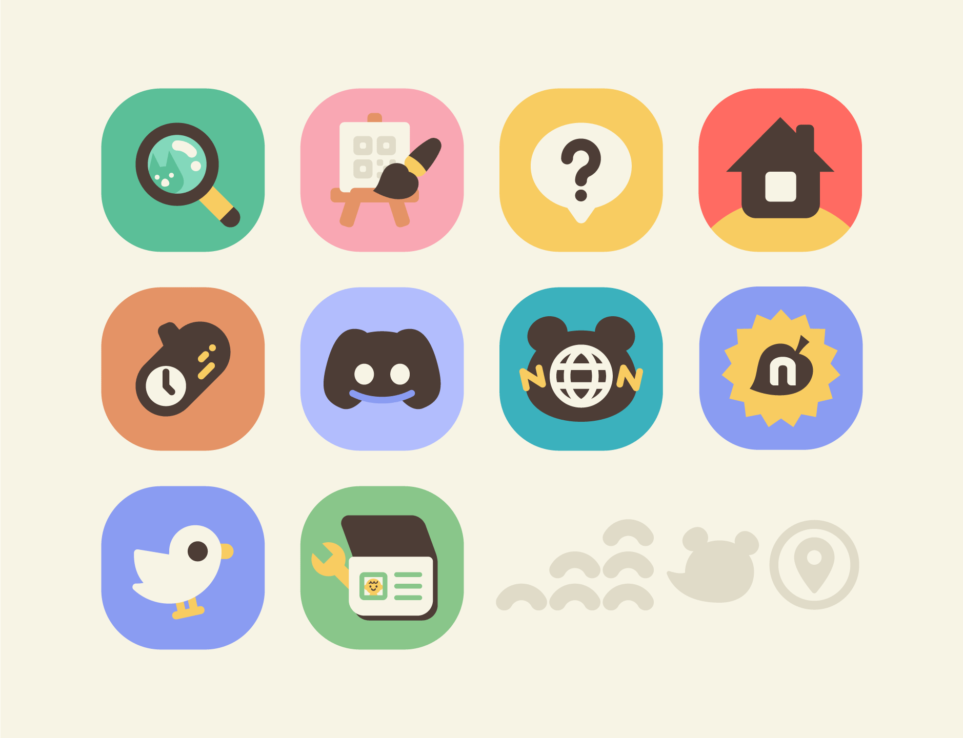
The icons imitate the minimalistic look that is used in the in-game smartphone-styled menu. Rather than copying icons from the game, I gave them my own twist with original designs such as the easel & brush instead of shirt & pen, or an open passport instead of a closed one. The changelog icon became a literal wooden log with a clock symbolising change. Twitter and Discord were challenging to make without making them stick out from the rest of the stylized icons. The Twitter icon was inspired by the Kurzgesagt birds.
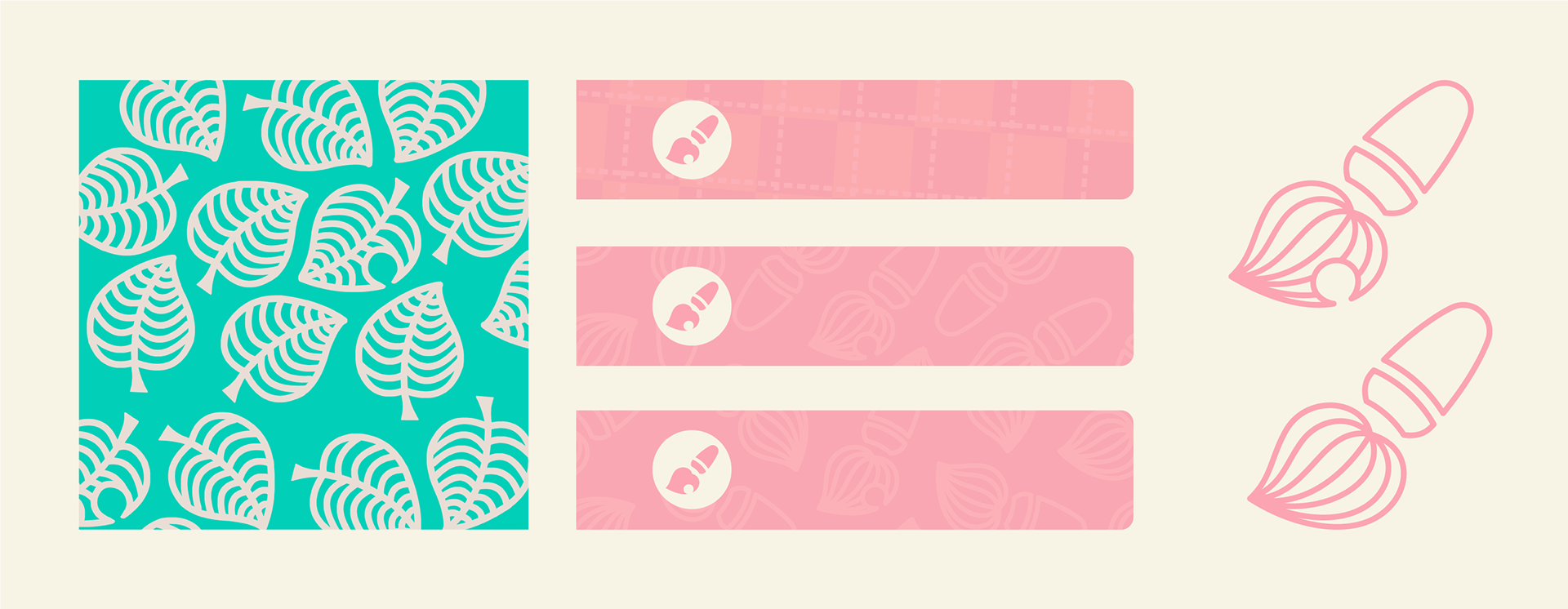
The challenge with the background pattern was to have even spacing between each brush and make it repeat seamlessly. New Horizons uses a outlined leaf pattern for some of the in-game elements, so I made a brush counterpart for our theme.
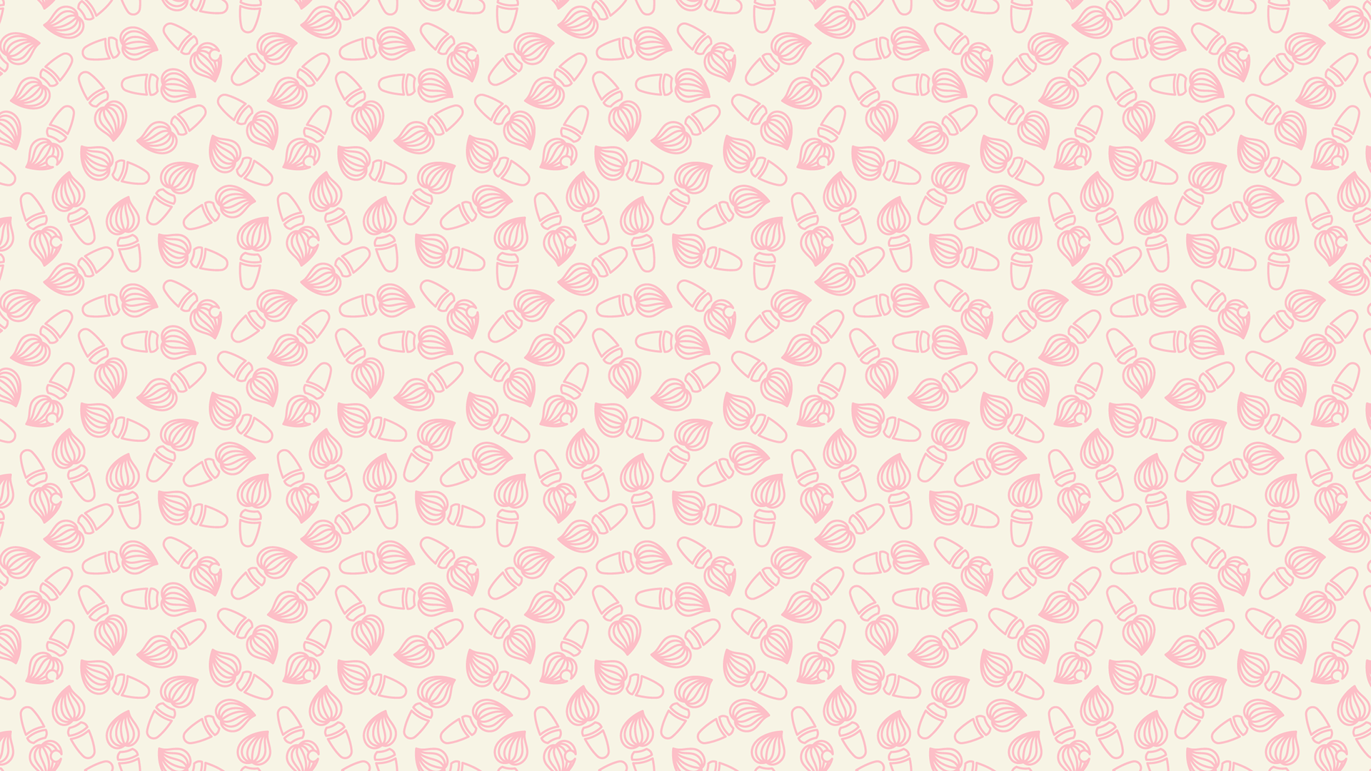
To make the landing page more appealing and less bland, we added a version of this brush pattern.
Cut content:
These two icons were supposed to help users differentiate between the NL (New Leaf) and NH (New Horizons) modes by making the pop up windows more distinctive from each other to avoid confusion.
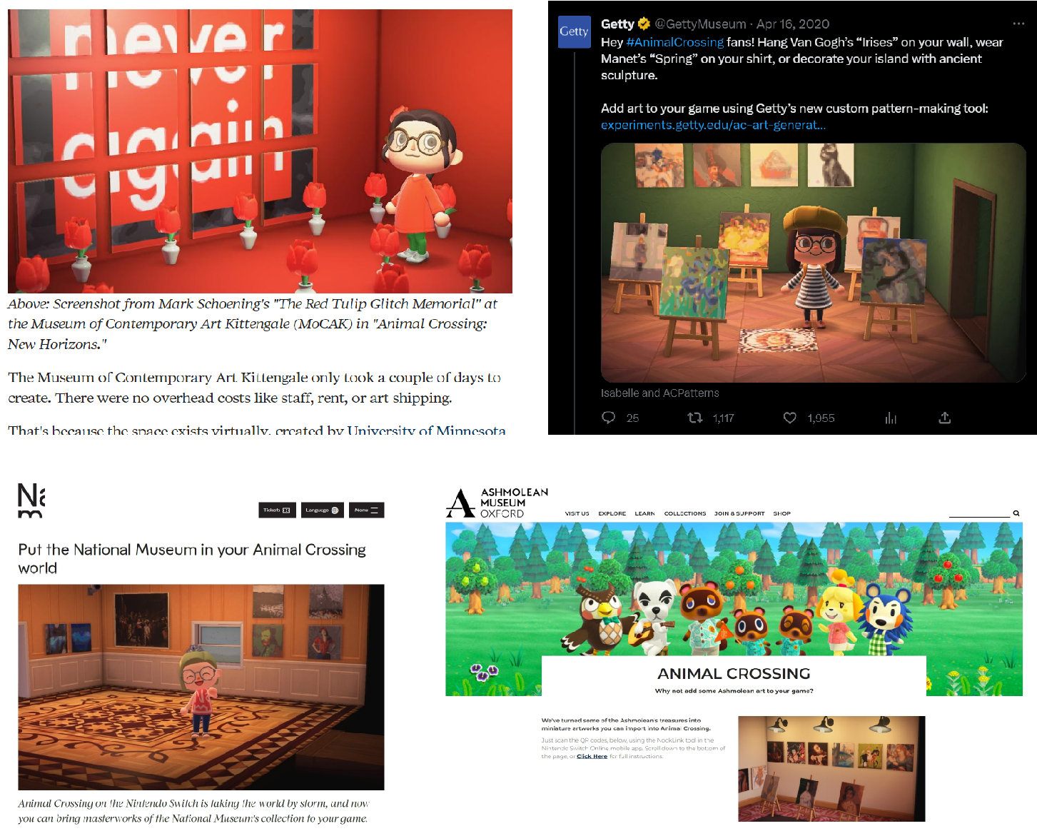
Several articles about the site were published and especially museums from all around the world took the opportunity to resonate with a younger audience to grow interest in historical artworks.
This is the old look of the landing page and the previous logo. I kept the original easel idea for the new editor icon.